Why Phone Screen Size and Resolution is So Important
As you know, there are lots of different things that you need to take into consideration when you’re building a mobile application.
With so much to keep track of, certain elements of development could get lost in the shuffle. That’s why I always say that you should stay organized with submission checklists and other tools.
But one factor that seems to always get swept under the rug and forgot about is the actual screen of the different mobile phones.
Phone screens and screen resolution are two things that you need to keep in mind before, during, and after you’ve developed a mobile app.
Why?
For starters, smartphone screens are important because there are lots of different screen sizes. Whether you’re deciding to build for Apple or Android, both platforms have tons of different devices.
Resolution and aspect ratio is also important. That’s because the resolution of different screens can affect how designers build their apps. Based on this information, there are certain tools that all app designers must have.
So as you can see, both screen size and resolution size are important, but for different reasons.
Understanding size and resolution can help you optimize your mobile app for a variety of devices. This refers to both smartphones, tablets, and even smart TVs or other screens where users can download your app.
With that in mind, I wanted to provide you with an informative guide for these topics. No matter what stage of development your app is currently in, I’m sure you’ll find this very helpful.
Here’s what you need to know.
How to calculate pixels per inch
You’ve got to understand the difference between the size of the screen and the dimensions of the screen resolution.
Screen size gets measured using inches. It’s the size of the actual screen of a particular device.
For example, here are the screen sizes of some of the latest iPhones from Apple that you’re probably familiar with.
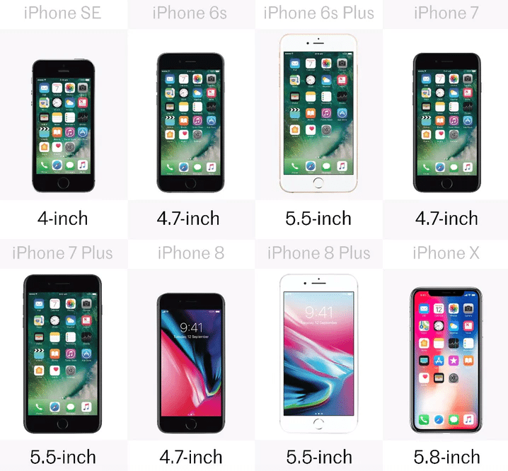
Not every mobile cell phone is the same. Some of smartphones have bigger screens. I’ve seen smartphone screen sizes that won’t even fit in my pocket. All of this impacts pixel density, pixel size, width, and more.
Here’s how to measure phone screen size. You need to use diagonal measurement. Start from top left corner of the screen and measure the length to the opposite diagonal corner. It’s pretty straightforward, and anyone with a ruler can do this.
This example uses inches. But if your developer or designer is using the metric system, they’d need to convert inches to centimeters.
Screen resolution is a little bit different. The resolution is measured by the number of distinguishable pixels that can be displayed in each dimension.
The iPhone X screen resolution is 2436 x 1125. While the Samsung Galaxy Note 8 has a resolution of 2960 x 1440.
You need to know the size of the screen as well as the resolution to calculate the pixels per inch (PPI) of a device. Here’s how you calculate PPI:
- Add the squares of both numbers in the resolution
- Take the square root of that number
- Divide the previous number by the size of the screen
It sounds a little bit complicated, but I’ll give you an example to show you what I’m talking about. You’re probably going to need a calculator to do this.
Let’s use the iPhone X, since it’s new, and we’ve already covered the screen size and resolution. We’ve got all of the information that we need to calculate the PPI.
- 2436 x 2436 + 1125 x 1125 = 7199721(squaring both numbers of the resolution)
- 7199721/2683.23= 2683.23(square root of previous answer)
- 2683.23
5.8 (inch screen) = 462 PPI
According to the Apple iPhone technical specifications, their PPI of the 2436 x 1125 pixel 5.8 inch iPhone X is 458, so our calculations weren’t far off.
Using this formula, try a couple of examples on your own. It’s easy to find out the exact specifications of different devices by just looking it up from the manufacturer’s website.
Basically, you’ve got to realize that since screen size and screen resolution both play a role in determining the PPI, it can tell you how well an image gets displayed on that particular device.
So what happens if you try to combine this formula using two devices of different sizes and resolutions? It just won’t work out well.
For example, let’s take the resolution of an old iPhone model like the 4-inch SE and apply it to 12.9-inch iPad Pro.
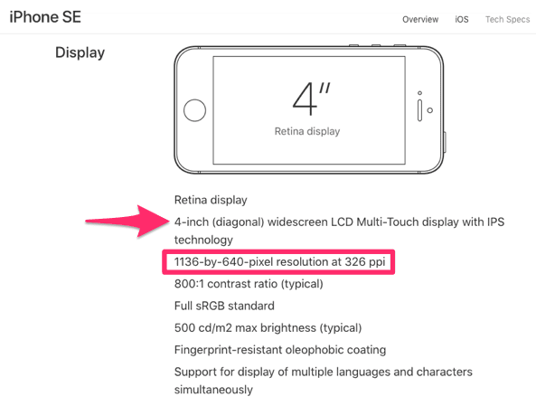
Follow the formula using the pixel resolution above.
- 1136 x 1136 + 640 x 640= 1700096
- 1700096/1303.88 = 1303.88
But now instead of dividing that number by the 4-inch screen size, like you’re supposed to, let’s divide it by the 12.9, which is the size of an iPad Pro.
- 1303.88 / 12.9 = 101.08
As you can see. The PPI is super low, which means that if this resolution were on a larger screen, the images just wouldn’t compute well.
That’s why you need to optimize your images to account for various screen sizes, but we’ll discuss that in greater detail shortly.
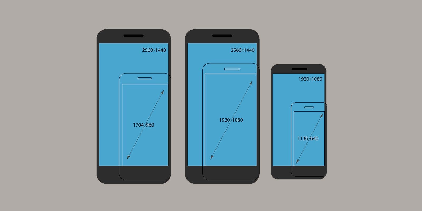
Different types of screens
So we’ve already established that different devices have a wide range of screen sizes and resolutions. But with that said, some resolutions are more popular than others.
Based on Internet web traffic from a global perspective, 720 x 1280 pixel smartphones are the most popular.
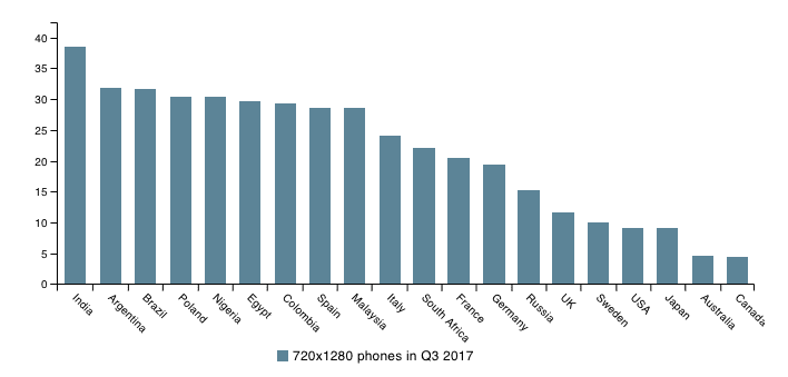
As you can see, these numbers vary based on location. However, it’s still valuable information. It’s always important to know which types of devices are the most popular when it comes to the mobile app industry.
This can be extremely helpful if your target market or the majority of people using your device are located in of the countries where these percentages are high.
You also have to account for other types of screens such as:
- HD screens
- QHD screens
HD stands for high definition, while QHD stands for quarter high definition.
The pixel resolution for high definition screens is 1920 x 1080. Quarter high definition screens have a 960 x 540 pixel resolution.
Some examples of QHD screens include:
- Sony Xperia M2
- HTC Desire 601
- Samsung Galaxy S4
So, what’s more popular? Full HD screens or QHD screens? Research shows that QHD screens are seeing a decline in popularity.
At the same time, we’re seeing a rise in Full HD screens in terms of global web traffic.
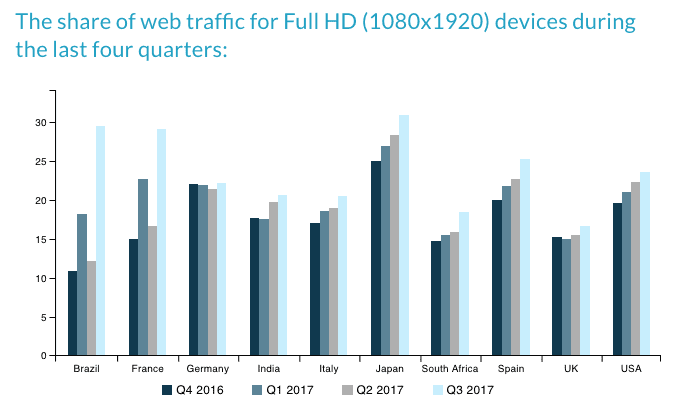
So plan accordingly when you’re building and designing various elements of your mobile app.
For those of you planning to build an app in the future, you should be focusing more on HD screens as opposed to QHD screens.
If these trends continue, which I expect them to, QHD screens will become a thing of the past. But for now, you should still make sure your app, images, and designs can accommodate as many devices as possible.
How you can take advantage of different screen sizes
OK. So phones, tablets, and other devices have different screen sizes, resolutions, and pixels per inch. There are even different types of screens.
Now what?
As a developer, you just need to keep all of this information in mind so that your app is optimized for all of the different sizes and devices.
If you’re only building your app with one type of screen in mind, it’s going to negatively impact the user experience of other devices. Poor user experiences will hurt your bottom line, which is something you obviously want to avoid.
As a designer, you should have the freedom and flexibility to get creative with your designs and animations.
Make sure you account for various screen sizes when you’re using Auto Layout to craft advanced iOS animations.
Here’s something else to keep in mind. Your app and other images still need to load flawlessly no matter how the user is holding their device.
That’s right. Besides the dimensions of their screen size and resolution, you’ll also have to make sure that there is a seamless transition between portrait and landscape mode.
Depending on the size of the screen, users are more likely to lean toward one orientation over another. Here’s some data to show you what I’m talking about.
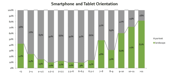
This is interesting. As you can see, as we get to devices with screen sizes larger than 9 inches, there is a significant increase in the amount of users who use landscape mode.
So for the most part, we can assume that people prefer to use the landscape orientation on their tablets.
But with that said, you’ve still got to test your app, images, and design elements for both orientations and make sure it’s optimized for all resolutions.
Conclusion
There is a difference between screen size and screen resolution.
You’re going to use both of these numbers to help you calculate the pixels per inch (PPI) of specific devices.
This is important to know because it affects the way that you design your app. You can’t build it with just one phone, tablet, or platform in mind.
For users to have the best experience, your app needs to be fully optimized for as many devices as possible.
There’s also a difference between HD and QHD screens. Even though screen sizes are moving toward a standard resolution, app designers still need to be aware that their app will be seen on many different kinds of screens.
So for the foreseeable future, you’ll need to continue designing and testing for as many contingencies as possible.
How are the design elements of your app accommodating the various screen sizes and resolutions for users with different devices?