How To Create An Amazing App Icon
Developing a mobile app that people can’t resist downloading isn’t as simple as merely giving them something useful.
You’ve also got to write a good app description, name your app appropriately, and – you guessed it – create an amazing app icon that makes them want to click.
The average smartphone has 41 apps that the owner uses regularly. And if you want your app to be one of those essential apps, you need an icon that makes your app look irresistible. Otherwise, you’ll have a tough time enticing people to download your app in the first place, much less actually use it.
In the past, app icons were designed purely with functionality and ease of access in mind, but today we know that a good app icon choice is based almost entirely on aesthetics .
And – make no mistake – good app icon design is critical to your app’s success.
You can use your icon to promote your app.
With app store discovery accounting for about 70% of app downloads, your icon serves as a graphical representation of your app as a whole, so it really defines your brand and the first impression your app makes on potential buyers. Make a bad first impression, and it’s likely that your potential customers will skip right over your app and opt for one of your competitors.
In fact, research shows that 92.6 percent of people put the most importance on visual factors when making a purchasing decision.
Want to learn how to make an app icon? Keep the following best practices in mind while designing your icon, and your app will be much more likely to attract your target audience.
App Icon Creation Best Practices
Pick a bold, unique shape.
Simplicity is key to creating an app icon that’s memorable and recognizable. If you don’t pick a shape that’s unique and bold, your app will end up blending in to the rest, meaning that fewer people will be enticed to download it.
It’s also important to note that you should try to incorporate what your app does into the design of the app icon somehow.
The Spotify app icon is a great example of a bold, unique shape that incorporates the app’s purpose into the design. Take a look:

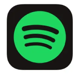
You can see that they’ve chosen two colors and a simple shape, which makes the icon easy to recognize. On top of that, the black lines inside the green circle represent increasing speaker volume. That’s because Spotify is a music app, so it immediately illustrates the app’s purpose.
Here’s an example of an app icon that isn’t so great:

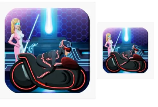
This app has way too many elements. I mean, you can kind of tell what’s going on in the larger version, but it’s super difficult to understand all of the elements and what they mean in the smaller version. And because the smaller version is the one people are going to see on their mobile device, that’s a major problem.
So, while your app icon design doesn’t literally have to represent what your app does, it should represent some aspect of the overall functionality if possible. That way, people can quickly understand the value of your app just by looking at the icon.
Avoid using a photo.
This applies even if you think the photo includes a bold, unique shape. If you have a photo you really like that’s simple, bold, and represents your brand, create a vector image version of it. Or use some of the elements from the photo to inspire your vector image design, like this design by the Sipp app:

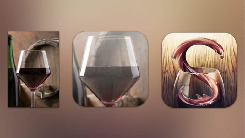
Image source: The Next Web
The Sipp app icon creators knew that the purpose of the app was to help users share information with their friends about the wines they tried. So their starting point was, of course, a picture of a glass of wine.
But they didn’t stop with the picture. Instead, they had the image illustrated and added a letter to it, improving the overall appearance of the icon and making it more memorable.
Don’t overload the icon with color and detail.
When designing your app, you have to keep in mind that the app will appear tiny on the user’s screen. That means that including too many colors or too much detail could hinder your app from standing out.
So limit yourself to two or three colors if possible, and resist the urge overload the design with detail. The simpler your app icon design is, the more it’ll stand out from the rest.
The Snapchat app icon is a great example of an app icon with a simple color palette and design.

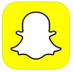
It’s a simple design with rounded corners. You can see that the two main colors are white and yellow, and the designer used a black border around the white ghost to make it stand out even more. It’s instantly recognizable from other icons on the home screen. So not only will it get the user’s attention in the app store, but it will also increase opens. And there’s not a lot going on in the design – it’s just a ghost on a plain background. That’s about as simple as it gets!
If you look through the app store, you might also notice that many app icons tend to have similar appearances. A recent study by Appbot revealed that many of the most popular apps have icons that share similar colorways.

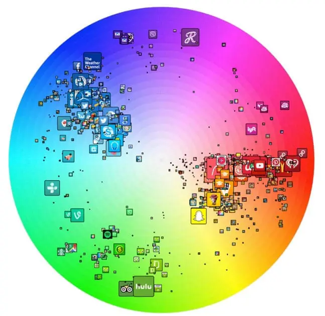
Red and blue dominate the landscape, while green is also pretty popular. But you’ll notice that the most prominent app icons tend to commit to just one or two colors.
Keep that in mind when you’re choosing the colors for your app.
And make sure the colors align with your brand. The color palette for the icon should be the same one you use in the design of the actual app, and it should attract your audience. Since 84.7% of people in a Secretariat of the Seoul International Color Expo survey reported that color accounts for more than half among the various factors important for choosing a product, its critical for you to choose the right color scheme.
Tip: Use contrast the right way in your design to draw potential customers’ eyes to your app icon. If you’re not sure which colors are best to use together or want to learn more about color theory in design, check out this blog post.
Don’t include words.
Think about it. Your app icon is going to look tiny on a smartphone screen, meaning that users will pretty much need a microscope to read any text you place on the icon.

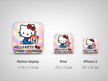
That’s why it’s best to leave text out of your icon design. If you create an effective app icon and name your app something appropriate, that will be enough to draw people in. Then, they’ll be able look at the app description to learn about what it is and what it does.
Now, you might be thinking:
Wait a second. Facebook technically uses text in their icon by putting the letter “F” there, and they have one of the most successful apps ever!
And you’re right. They do.

This design works for them because it includes a bold, unique shape that represents their already well-known brand. So, if your brand is already well-known and you feel like a specific letter represents it, you may be able to create an iconic app icon with just that letter.
Otherwise, I strongly advise you to come up with something different that represents your app’s functionality. Just because Facebook can get away with using a single letter doesn’t mean that’s the best tactic for you.
Consider incorporating some kind of border.
We’ve already talked about how Snapchat put a border around the ghost in their app icon, but you could also put a border around the entire icon image. The Adobe Photoshop Express app icon is a great example of effective border use:

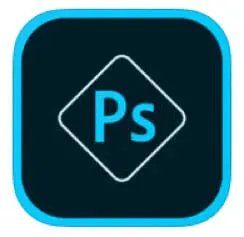
You can see that their overall design is still simple and the border makes the icon stand out.
The main reason a border can help create more impact for your icon is because it emphasizes the content inside the border, making it stand out more in the app store. And that can easily result in more downloads.
You can even get creative with the border itself, creating a 3D effect like this:

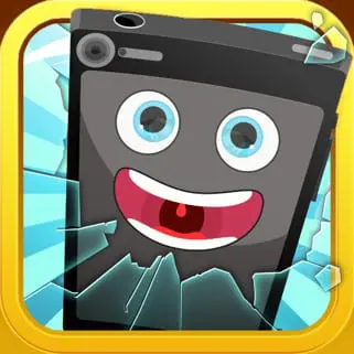
But remember – the border you use around your icon should have a strong color that contrasts well with the colors inside the border, or your icon might not stand out at all.
Look at your competitors’ app icon designs.
When you do this, you’ll be able to figure out which color scheme and design aspects could help you differentiate the most.
For example, let’s say you’re creating an app for users who want to check and organize their emails. Your best bet is to look up other email apps to find out what kind of design your competitors use. Here are some of the first ones that show up in the Apple app store when you search for “email”:

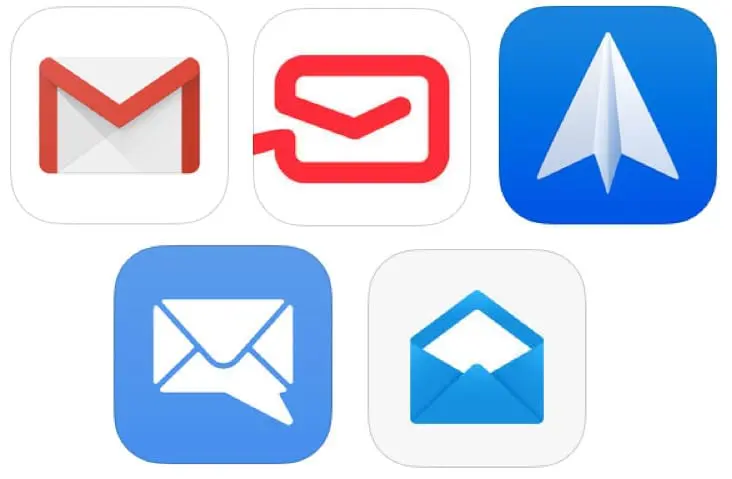
Lots of clean app designs, right?
They aren’t all the same thing, but there’s a similar theme throughout all of these. Most of them include a picture of an envelope, and all of them include either red and white or blue and white as the color scheme.
To stand out from these competing apps, you might consider choosing a different color based on your brand and target audience. You could get creative and choose a symbol other than an envelope, although you’d still want to pick something that represents email if possible.
See how quickly a simple competitive analysis like this could help you figure out how to set your app apart from the rest?
It only takes a few minutes to look up your competitors, so there are no excuses for not doing this before you start designing. If you do skip this step, you may end up with an app icon that looks just like everyone else’s, giving users no incentive to download your app over your competitors’ apps.
Create several app icon variations to consider.
You can simply sketch these variations on a piece of paper or have a graphic designer handle it for you. The point here is to brainstorm and give yourself several ideas to consider before finalizing your app.
Here’s a good example of app icon sketches from a Behance case study:

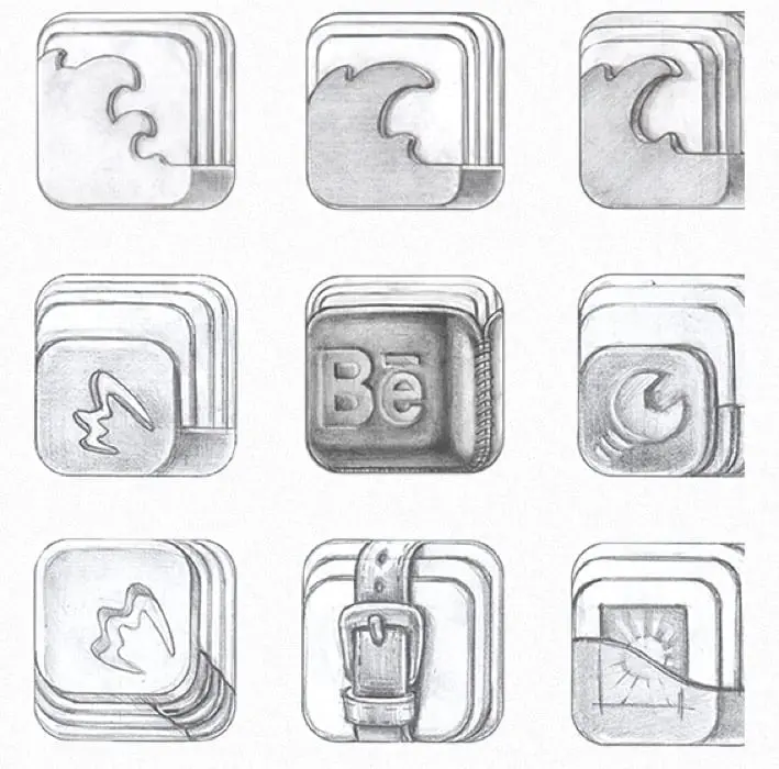
When you see your app icon sketches side-by-side this way, it’ll be easier to determine which elements you like best and which icon is most likely to entice users to download.
Look at your icon on a phone screen before you make a final decision.
When designing your app icon, you’ll need to consider how it will look against the colors of mobile device wallpapers. Keep in mind that most users have a unique wallpaper, so you want to make sure your app looks good against a range of dark and light backgrounds.
Some users even choose hectic live wallpapers with a range of colors and objects that can make apps hard to find on the screen. So it’s your job to make sure your app will always show up clearly.
And think about how the app looks in general on a phone screen too. If it’s too detailed to be recognizable or doesn’t look clean from a design perspective, you’ll need to make some changes.
Make sure your app icon is the right size.
When you create your app icon, it needs to be the appropriate size for the screen it’s going to be viewed on. And this isn’t an optional step for iOS app icons – Apple won’t even accept your custom icons if they aren’t the right icon size.
The last thing you want after spending so much time designing an appropriate app icon is for it to be rejected by the app store. So, if you’re going to release your app in the Apple app store, read their sizing guidelines here and make sure you follow them carefully. Wherever you plan to release your app, look for their required iOS app icon guidelines so you can follow them and make sure your app is accepted.
A/B test different app icons.
Doing so will help take the guesswork out of picking the best app icon design and help you choose the one that best resonates with your target audience.
If you’re releasing your app on Android, you can simply use the Google Play A/B testing feature. This is ideal for all Android app icons. If you’re releasing your app for iOS or somewhere other than the Google Play Store, try A/B testing your app with your Facebook audience – it’ll cost you some money, but the insight you’ll gain will be worth it.
Tip: For a more in-depth look at how to properly A/B test an app icon, check out this blog post. And for ideas on how to A/B test your app as a whole, read this advice from KISSMetrics.
Options for Creating Your Own Custom App Icons
You may be able to find a free app icon maker online, but you’re better off using quality design software or partnering with a professional graphic designer. That way, you end up with a well-designed icon that’s original and avoid having to work within the constraints of the free program (since it may only offer a few different fonts and images).
Let’s discuss these options a bit more in-depth now so you can make an informed decision.
Use Adobe Illustrator.
If you’ve worked in Illustrator before, you probably already know that its functionality makes it a great option for designing a vector image to use as your app icon.
After you’ve sketched your app icon design ideas, choose the one you want to work with, and import the sketch into Illustrator. Then, you can begin designing your icon based on the sketch.
Tip: If you don’t have lots of experience working in Illustrator but want to use it to design your icon, you can read this blog post for an easy tutorial. If you do have plenty of experience with Illustrator and Photoshop alike, here’s a more intermediate level guide to designing your app icon.
Hire a graphic designer or graphic design firm.
If you’re not a seasoned designer yourself, hiring one is probably your best bet for getting an app icon that resonates with your target audience and looks amazing in the app store.
Here are a few tips to help you hire the right graphic designer:
- Look for a designer who specializes in app icon design. If they’ve never designed an app icon before, they may not have a deep understanding of app icon design best practices. So, try to look for a designer who has a portfolio full of attractive app icons. They should also be comfortable creating an Android app icon as well as iOS icons.
- Avoid websites like Fiverr and Upwork. While some designers on these kinds of sites can produce high-quality work, you’re better off looking for a professional graphic designer on LinkedIn or asking one of your colleagues to recommend a designer they know and trust.
- Look for testimonials. If you see that the designer’s previous clients were happy with their results, there’s a good chance that you’ll be happy with your app icon design.
Keep in mind that you often get what you pay for when hiring a graphic designer, and don’t expect to get your icon designed for cheap. The financial investment will be well worth the extra downloads your app gets because of its well-designed, eye-catching icon.
And remember: if you hire a designer to create a handful of designs to choose from and none of them meet what you’ve been looking for to represent your app, don’t settle. Your app icon is important, so you need to get it right.
In Conclusion
Now, you have all the information you need to design your app icon in a way that will attract potential customers. And before you know it, you’ll be able to release your app and watch as its unique icon design attracts huge numbers of downloads.
Whether you’re building an Android mobile app and need a custom icon, you’re creating game app icons, or something in between, I hope this guide steered you in the right direction.
The standards of app design overall are still being set, and just as mobile devices continue to evolve, so will the appearance of the app icons made for them.
So, experiment, run A/B tests, and find out what icons work best for your brand. Your app will have a greater chance of succeeding as a result.
Do you have any questions about how to create an amazing app icon? Ask away in the comments section!